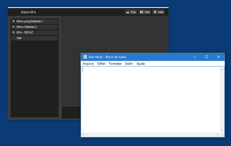
Well,
I wouldn't go as far as calling that a bug, as this residual line is only there in resizable forms it seem to be there by design to signal the resizability, probably. It's a bad UX design, as you can't resize a form at that line (well, not only at that line, the main hotspot for form resizing still rather is the bottom right corner, secondly any corner, thirdly some border and lastly the top border). So the visual hint for a resizable form should rather only be done by a resize corner, but I wouldn't wait for this to change automatically.
If you want to shout out at MS, first calm a bit down and call it connect to MS, then there is
Don't report this as VFP bug, though, it's not different, if you create a resizable window with no titlebar from any other tool. Well, VFP isn't in the list of products anyway. The white line somehow falls into the category "Design and User Experience", but there are no products associated to that. Also Winforms is no product in itself, rather (still) a base technology of windows desktop UI/UX.
From the other point of view, you might find a reasoning for this in documents about Windows UX Design principles. A non standard/themed form alone is breaking the UX guidelines, so also avoid to report the problem with your skinned form screenshot, rather show a plain vanilla resizable black canvas form without titlebar and it'll become obvious why the white line is disturbing for such a dark form, no matter if this is taken further from a current Windows desktop theme or not.
Bye, Olaf.


